
Hi everyone. We returned from our trip to Vancouver. We saw U2 at BC Place. A big stadium with a dome. Vacouver is gearing up for the 2010 Winter Olympics. I also saw Stephen Sondheim -- it was sort of a chat about his career. It has been so long since I have posted. But I will be showing you a few things I picked up in Vancouver and maybe a couple of pix.
Thanks
Terrie
Sunday, November 1, 2009
Friday, September 18, 2009
Haul Video from Paper Tales, Michaels, and Target
Hi everyone,
Here is a link to my craft supply haul. As you know I am always looking for ways to extend my crafting budget. The Hero Arts stamp is printing beautifully and look forward to showing you my spooky Stickles creations.
Take a look at the video. Thanks for watching!
Terrie
PS: I am really in need of video help... I have Adobe Premiere CS3 but my exporting and maybe importing of video is lacking and seems to consistently fail when I upload. So I have begun using Windows Movie Maker - not fancy but it is working. Let me know what settings you use. My video camera was an unexpected gift and the quality gets marginal reviews by the pros but o.k. marks from beginners like me. Any assistance you can provide would be greatly appreciated.
Wednesday, September 9, 2009
Haul Video from the Stamp Addict
Hello everyone,
I have been a bit behind in blogging lately. My newest obsession is watching haul videos... it is free to watch what others have bought! So I tried my hand at a haul video using a really cheap camera which I have since returned to Big Lots.
Here it is. I promise everything was not blurry. :)
Let me know if you have any questions about the products. I also am looking for tips for the Stamp N Bond powder and the perfect pearls.
Thanks!
Tuesday, August 25, 2009
Silhouette Vinyl Labels on White Boxes
Well I finally fou nd the Adobe Illustrator windows xp plug in for the Silhouette. It is called Cutting Master2 CraftROBO and there is a You Tube install video.
My own pet peeve is that the software that comes from Craftrobo leaves much to be desired if you have ever used Illustrator, Freehand or any drawing software.
The Quickutz Craftrobo software is useful for cutting files that you purchase from Quickutz, but for fonts and scaling and control go to the Craftrobo site and download the plug in. You can more easily control the placement of images to cut. Cutting fonts is a snap, no tracing required.
So here are my Big Lots $2 nesting boxes from the Martha Stewart wedding clearance. Yes, you got all 3 boxes for $2.
The vinyl is a dark blue and the font is A&S Black Swan.
The boxes before the label...


The after photos -- ok I know there are a lot of photos, but I was so excited that I could get fonts to cut out well -- even in the small half inch high letters.


 nd the Adobe Illustrator windows xp plug in for the Silhouette. It is called Cutting Master2 CraftROBO and there is a You Tube install video.
My own pet peeve is that the software that comes from Craftrobo leaves much to be desired if you have ever used Illustrator, Freehand or any drawing software.
The Quickutz Craftrobo software is useful for cutting files that you purchase from Quickutz, but for fonts and scaling and control go to the Craftrobo site and download the plug in. You can more easily control the placement of images to cut. Cutting fonts is a snap, no tracing required.
So here are my Big Lots $2 nesting boxes from the Martha Stewart wedding clearance. Yes, you got all 3 boxes for $2.
The vinyl is a dark blue and the font is A&S Black Swan.
The boxes before the label...


The after photos -- ok I know there are a lot of photos, but I was so excited that I could get fonts to cut out well -- even in the small half inch high letters.


Sunday, August 16, 2009
Here is my Creative Space and Craft Room

My first video attempt. Let me know what you think.
Dubbing to come, once I figure that part out. :)
I am attempting to upload it to Youtube now.
It's late. More link posts later.
OK, so you have to use edit HTML. Night Night.
I am attempting to upload it to Youtube now.
It's late. More link posts later.
OK, so you have to use edit HTML. Night Night.

Saturday, July 18, 2009
Kwerner Challenge 56 / Mojo Monday - Happy Birthday


The colors were fun: deep red, pumpkin, saffron, celery, ballet blue and white.
The bows inspired the all over background but multi-colored.
I was feeling layout challenged so... I did a combo challenge with Mojo Monday.
Happy Birthday Card.
- Tried out my new -- well new to me Stampin Up markers. Great bargain on Etsy.
- Fun stamps from four different companies:
The focal point stamp -- the Doxie is from CowtownStamps.com
The doxie stamps may yield a donation to a rescue organization
The pawprint(s) stamp from Inkadinkado - Bouje
The hot-diggity-dog is by A Muse
The birthday greeting is part of a clear set ... other details unknown right now. - Inks from JoAnn's $1 bin plus the yellow is the Stampin Up brush marker.
- Tried my hand at the blender pen...
- Texture Plate by Fiskars - blue one labeled "fabric"
- grommets and crop-a-dile to simulate the collar
- paper from American Crafts and DCWV strips for Ellison. 80# white cover.
- 5.25x8.25" card


Enjoy! I always appreciate your comments and suggestions.
Sunday, July 12, 2009
Papercrafts presents MoxieFab World...
Check these out

and this one too!

http://www.moxiefabworld.com/2009/07/five-x4-for-friday-lets-cool-off-with.html
All doxies lovers have got to check out all of these wonderful doxie items.
Monday, June 15, 2009
Baby Shower Invite - Hero Arts Quikutz Challenge
Oscar's little sister is having her first baby. So I thought it was a great way to break in my new - used Silhouette. You know that I am always a bargain shopper, and found one listed on ebay and I thought o.k. $100 I will give it a try. Here is my first full blown project. All the parts were a lot of work but assembly was quick. 20 invitations later. Here is the first one, the info has been changed to protect the hosts. Enjoy!
20 invitations to make... Lets play with my new Silhouette.
I used Stampendous CRE 171 (baby overalls) American Craft markers and blue flock for the “jeans.” The ink, my favorite Ranger Archival Ink in jet-black.
The polka dot background is by Hero Arts called Raindrop Background. I used Versamark ink with white embossing powder.
The Baby header was a die cut bookend from the Quickutz store (attached to my drawn box). The rattle is from the Quickutz store. The scallop circle can also be a die cut but I used a punch.
The “shower” die cut was the challenge. I've had the Silhouette for less than a week and the font of the die cut matches the invitation text! This took a bit of time and persistence and help of Photoshop… but I did it!
The text card was printed on my Oki LaserJet. (I changed the personal contact info for the web picture…)
The base of the card is a die cut and the blue is a die cut attached via the Xyron machine.
I also did another version with the little bear... this is from the Hero Arts Clear stamp set, see other pix. The card is the same the lighting is different, one with flash and one without...
Finished card is 8.5x5.5”
Here is a link to the Flickr Hero Arts Blog with some
very nice comments. They are a great group.


Sunday, June 7, 2009
The Pink Elephant Challenge
 Here is a gift card holder for a new baby that uses pink, brown and white.
The brown stock is a rich chocolate brown textured cardstock from American Crafts. The pink stock was white on the reverse, so you have space to write a personal greeting.
The small blocks were made with nestabilities dies.
The scallop edges are from Fiskars and Martha Stewart.
White faux stitching - Uniball white pen.
The stork and Congrats are the same stamp, I just trimmed out the stork, prismacolored the "package" and stamped the congrats separately with Versamark ink and white embossing powder.
Enjoy!
Here is a pix of the inside too. Click on the pix to enlarge.
Visit a new challenge group for me called The Pink Elephant.
Disclaimer: I made this type of card for another challenge too for the Stampin Out Alzheimer's website and liked it so much I thought I would share it again. I am going to make one in baby blue... traditional I know.
Mojo Monday from June 1, 2009

Here is the card and there is the sketch. I don't know why I struggled. But at some point you just shoot the pictures. I think because I tried a smaller finished card, I felt I didn't have enough room to embellish without clutter. Does that make sense?

Here is the card with the stamp set by Hero Arts. I don't have any stamps by Verve yet. The prisma color pencils and gamsol lend the color. Three red buttons and two circle punches and a butterfly punch. Let me know what you think.
Thanks,
Terrie
Sunday, May 31, 2009
Digital Scrapbook Page
Here is another entry from the Stampin' Out Alzheimers Challenges. This one is a scrapbook page. We were able to download a free digital kit. While I had a bunch of fun summer item and lovely papers, I modified for my photo.
Here we go...

Here were the rules:
"Your challenge is to show me your best project - it can be anything (pure digi layout, hybrid layout, hybrid card using the papers printed on your color printer, altered project, whatever) - using Flip Flop Tan. The majority of your supplies should come from Flip Flop Tan - for example, you can add alphas and a font if you're doing a layout or cardstock if you're making a hybrid project."
Here's a snap of the kit and I have linked it to the site if you want to do some browsing and shopping:

Stampin' Out Alzheimers
Here is one of my projects from the Stampin' Out Alzheimers website.
A really good cause and a small donation that created a lot of wonderful work.
The site will not be up very much longer, so I though I would post what I created based on the challenges.
Here we go.
Here is the first challenge I participated in. This was a layout challenge.
I made a birthday card for my mother in law's 81st birthday.
I hope she likes it.
 Here were the rules: Julee Tilman, owner of Verve Stamps, was kind enough to "donate" this week's MoJo Monday sketch (along with a pretty SWEET prize for one lucky winner) as a challenge here on the SOA site. Here's a look at this week's sketch from Mojo Monday.
Tuesday, May 26, 2009
Kwerner Challenge 53 version one
A cowboy twist... from the West

 This is the first of my two posts -- I like this card best and could not think of a better way to use some of the colors then with the wired bandana ribbon* that I have had for quite some time. Blue card stock from American Crafts. Yellow scallop punch. The round rubber stamp is from Hero Arts. Black button from Fancy Pants and white thin satin ribbon (Michaels sale).
The inside is accessorized with my favorite spool of red thrift store cord and another Hero Arts Stamp. Tip: I only inked the second line... Ink is a rouge red Que Chalk Ink.
Love the bright colors!


*Yes, I have a large collection, selection and obsession
with ribbon, string, rick-rack, trims and fibers.
Kwerner Challenge 53 version two


Well here is the lady bug card. I used rub-on images for the butterflies and the sentiment. (American Crafts) The lady bug was created from punches -- thank to a You Tube video for the tutorial. Yellow American Crafts Markers to accent the butterfly wings. The yellow rick rack came from my stash of trims and the popular Fiskar's scallop border punch. Enjoy!
Thursday, May 21, 2009
Check this out -- The Next Level
I have found a new site and am excited to see how it progresses. Take a look and register as a follower and you might win this great looking -- err tasting Blog Candy.


From their site:
"So what about the fantastic Blog Candy that is offfer. Below are the photos of the two stunning prize packs that will be awarded on Launch day, Monday 1st June. Anyone who has registered as a Follower of The Next Level and who also supported us with the promotion of the new blog and prize candy on their own blogs will go into the prize draw. The two winners will be announced as the new Challenge goes live bright and early on the Monday morning."
Tuesday, May 19, 2009
Kwerner Color Inspiration Challenge 52
Challenge No. 52


I edged another white card with more aqua ink. I mounted everything on mustard cardstock. I embellished with a custom made (by me) sand diecut flower made from scraps of fleece from our petbedding line. The aqua flower from Prima was inked to coordinate. The white button is "paper threaded" with saffron yellow (marigold) cardstock by American Crafts. The I Love You stamp is from Stampin Up and stamped in aqua pigment ink from studio g.


Wow, these colors were not jelling easily for me. So I took a step back and thought well, paper isn't the only medium to play with, so I focused on ink.
I used my lavendar plant's leaves as the "background stamp".
Thrifty Tip
How I did it:
I dabbed ink onto the lavendar leaves and rolled the brayer over the leaves to pick up the ink. Then transferred the inked brayer onto the white paper. I combined the images and overlapped and moved the leaves to create other "designs". I stamped them using aqua, saffron, and sand inks.

I edged another white card with more aqua ink. I mounted everything on mustard cardstock. I embellished with a custom made (by me) sand diecut flower made from scraps of fleece from our petbedding line. The aqua flower from Prima was inked to coordinate. The white button is "paper threaded" with saffron yellow (marigold) cardstock by American Crafts. The I Love You stamp is from Stampin Up and stamped in aqua pigment ink from studio g.
Saturday, May 16, 2009
Top 10! Kwerner Color Inspiration No. 51
I am so excited that my card creation was selected
in the top 10 round up
for Color Inspiration No. 51 at Kwernerdesign.com!
Here is the link to the top 10 group.
I have to say there were so many fab cards that were terrific
I don't know how she selects them...
 This is Roger, you can see how excited he is that mom's card was picked. :)
in the top 10 round up
for Color Inspiration No. 51 at Kwernerdesign.com!
Here is the link to the top 10 group.
I have to say there were so many fab cards that were terrific
I don't know how she selects them...
 This is Roger, you can see how excited he is that mom's card was picked. :)
Just a note to all of you who think "Oh, I shouldn't submit my work..." Well just do it anyway. It is really fun to share your work with others that enjoy similar interests. And just because you don't have the same supplies as the other girls and boys doesn't mean you can't play. Besides, maybe you too might get picked at least once. It is really fun and keeps the creative juices flowing.
PS: Thanks winter for your comments... I really appreciate you checking in!
PSS:Thanks Kristina for hosting the color challenge,
I am certain it takes a lot of work and you're videos are fab too!
Here is the stamp set --

Thursday, May 7, 2009
Kwerner Challenge 51 version two


I tend to take a design theme and embellish in a different way. This gives me a chance to practice techniques. This is the first card I made. Notice the red daisy... but I liked it anyway. The fun part of this for me is the "ribbon". It is actually cotton hem facing. I got it at a local thrift store! I first stamped on the cotton with Brown Stazon ink. Then after a blog comment, I tried it with Versamark and Tim Holtz Vintage Photo embossing powder. I pressed the ribbon, stamped and embossed on top of a piece of foil to try to melt the powder a bit better.
So -- white cotton "ribbon", brown ink, dark brown background with 3 rounded corners, mustard cardstock layer, and red ink flower detail! Sentiment stamp from Stampendous Clear Stamp Set no. SSC134 - Encouraging Words. Daisy Stamp - dollar bin at Michaels.
So -- white cotton "ribbon", brown ink, dark brown background with 3 rounded corners, mustard cardstock layer, and red ink flower detail! Sentiment stamp from Stampendous Clear Stamp Set no. SSC134 - Encouraging Words. Daisy Stamp - dollar bin at Michaels.

I hope you like the card. I feel really good about it and wanted to share it too.
Click on the image below to enlarge the detail and read the text.
Click on the image below to enlarge the detail and read the text.

Just a note to share: I think I will be sending the card to a special girl who lost her Dad a year ago on May 15th and it has been a difficult year. She's going to turn 16 on June 2nd and I want her to know we love and care. Please keep her in your prayers too.
 Here is a photo of the first version, but I really wanted to make the brown pop. I trimmed the final cotton ribbon to make a longer tail. I also added some more mustard cardstock inside to allow for an easier way to add a personal message.
 Here is a photo of the first version, but I really wanted to make the brown pop. I trimmed the final cotton ribbon to make a longer tail. I also added some more mustard cardstock inside to allow for an easier way to add a personal message.
Kwerner Challenge 51 version one

Well this weeks challenge colors were chocolate, rose, mustard and white.

I used Versamark ink for the watermark effect and embossed it with clear matte embossing powder. More Versamark for the stamped sentiment and white detail embossing powder. Uniball white ink pen for the butterfly trail. Chocolate brown cardstock for the butterfly and red-rose satin ribbon. The one daisy is also stamped with red ink and embossed with the same matte clear powder.
Thank you in advance for your comments and suggestions. I really appreciate all of you.
Thrifty Crafter Note:
Thrifty Crafter Note:
The actual product list will come on Friday or Saturday-- lets just say the Daisy stamp is by Kolette Hall for studio g. (The $1 bin at your local big box craft store!) I really like the line and simplicity of the image. The sentiment is from PSX and a Big Lots find. It is nice and crisp that embosses well with the fine detail powder.
Wednesday, May 6, 2009
Amuse Fortune Cookie
Ok, so this one isn't quite so simple. But I was really inspired by the stamp and had to go for it. White base card, red and green stock that I embossed with the cuttlebug machine and the fiskars embossing plates. I really wanted the texture to contrast with the fortune cookie. I stamped the fortune cookie and the fortune in brown and embossed it and trimmed it out. The fortune was cut freehand, it is removable and I edged the fortune in red to coordinate with the red layer. The brown thanks is also a cuttlebug diecut -- it is part of the Olivia font set that was on clearance at Michaels -- I didn't realize the alphabet had the welded die cuts until I opened the package.


Be sure and click the image to enlarge
and see the embossed detail.


Be sure and click the image to enlarge
and see the embossed detail.
Saturday, May 2, 2009
kwernerdesign Color Inspiration #50 final
It is challenge 50...

and, well, I got a bit obsessed.
I tend to lean toward simplicity when creating. So, this one is the one I am linking for the challenge. This is a wedding card for a very special couple
who are in their late 20's.
I was going for fresh and fun like the colors in the challenge.
I appreciate all comments and suggestions.

A note to Kristina -- you really are amazing and finding your videos has spurred my creative side that I don't exercise very much at my "normal job". So simply, thanks and congrats on such a successful blog.
All over background stamp in turquoise pigment ink. Red layer flat on card. Blue layer raised with pop dots. Brown layer edged with Fiskars scallop blade and raised with more pop dots. love & cherish is a white rub-on mini mark by American Crafts. Favorite yellow ribbon knot. Stamp - Hero Arts. Papers from my scrap collection. Corner Rounder.
How much?
I like the other one too, it will be nice to mail for mom.

and, well, I got a bit obsessed.
I tend to lean toward simplicity when creating. So, this one is the one I am linking for the challenge. This is a wedding card for a very special couple
who are in their late 20's.
I was going for fresh and fun like the colors in the challenge.
I appreciate all comments and suggestions.
A note to Kristina -- you really are amazing and finding your videos has spurred my creative side that I don't exercise very much at my "normal job". So simply, thanks and congrats on such a successful blog.
All over background stamp in turquoise pigment ink. Red layer flat on card. Blue layer raised with pop dots. Brown layer edged with Fiskars scallop blade and raised with more pop dots. love & cherish is a white rub-on mini mark by American Crafts. Favorite yellow ribbon knot. Stamp - Hero Arts. Papers from my scrap collection. Corner Rounder.
How much?
- White card base was ready made from Target clearance shelf --
68 cents for 8 thank you notes with matching craft envelopes. - Turquoise Ink - 99 cents - JoAnn's
- Yellow ribbon - 99 cents - Michaels
- $12.50 Hero Arts DesignBlocks Stamp
I like the other one too, it will be nice to mail for mom.
Thursday, April 30, 2009
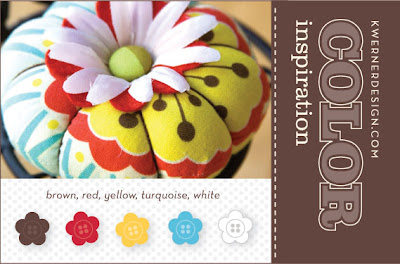
kwernerdesign Color Inspiration #50

Well here it is, my submission for the Design Challenge 50. It feels really good to be part of such a diverse and dynamic group of talented people. More details about the card, but I wanted to get the image up and posted before the deadline and what will likely be a full weekend.
Turquoise textured card background. White ribbon and my hand writing. Yellow scallop punch flowers. Red buttons. Brown stock and butterfly punch. Clear and white embossing powder with Versamark ink.
Thanks! I appreciate any comments and suggestions.
Subscribe to:
Posts (Atom)


