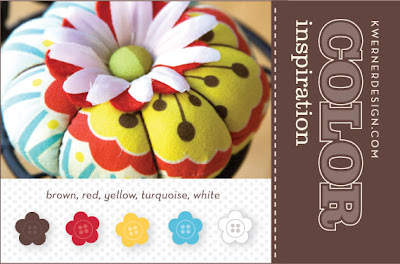
Showing posts with label kwernerdesign Color Inspiration. Show all posts

Thursday, March 18, 2010

Using Adobe Illustrtor to Cut - Video by Kristina Warner

Hi, I found this link but digging around on Paper Craft Planet. I subscribed to a group of "non cartridge" digital machine cutter users. This video is not mine, but I will try to embed the link. Thanks to Kristina for making this video and I hope it helps some of you with Illustrator. I like to cut from Illustrator especially when I am using postscript (non-true type) fonts and graphics or clip art that need some cleanup.

____________________________________________________________________________________

Illustrator to Quickutz Silhouette - Merged Letters from Kristina Werner on Vimeo.

Monday, January 11, 2010

kwerner design color challenge 57

Well it has been awhile since I have participated in a challenge. So here it is. More details to come regarding the paper, red satin ribbon, prima flower, JoAnn's bling, white embossing powder, classic I Love You stampin up stamp and the great heart border Martha Stewart punch. Enjoy!

Check out my YouTube videos. I will be trying my hand at creating with the shopping goodies really soon!


Check out her blog, you will find great cards and a kind spirit.

Saturday, July 18, 2009

Kwerner Challenge 56 / Mojo Monday - Happy Birthday


The colors were fun: deep red, pumpkin, saffron, celery, ballet blue and white.
The bows inspired the all over background but multi-colored.
I was feeling layout challenged so... I did a combo challenge with Mojo Monday.

Happy Birthday Card.
  • Tried out my new -- well new to me Stampin Up markers. Great bargain on Etsy.
  • Fun stamps from four different companies:
    The focal point stamp -- the Doxie is from CowtownStamps.com
    The doxie stamps may yield a donation to a rescue organization
    The pawprint(s) stamp from Inkadinkado - Bouje
    The hot-diggity-dog is by A Muse
    The birthday greeting is part of a clear set ... other details unknown right now.
  • Inks from JoAnn's $1 bin plus the yellow is the Stampin Up brush marker.
  • Tried my hand at the blender pen...
  • Texture Plate by Fiskars - blue one labeled "fabric"
  • grommets and crop-a-dile to simulate the collar
  • paper from American Crafts and DCWV strips for Ellison. 80# white cover.
  • 5.25x8.25" card


Enjoy! I always appreciate your comments and suggestions.

Tuesday, May 26, 2009

Kwerner Challenge 53 version one

A cowboy twist... from the West

This is the first of my two posts -- I like this card best and could not think of a better way to use some of the colors then with the wired bandana ribbon* that I have had for quite some time. Blue card stock from American Crafts. Yellow scallop punch. The round rubber stamp is from Hero Arts. Black button from Fancy Pants and white thin satin ribbon (Michaels sale).

The inside is accessorized with my favorite spool of red thrift store cord and another Hero Arts Stamp. Tip: I only inked the second line... Ink is a rouge red Que Chalk Ink.

Love the bright colors!


*Yes, I have a large collection, selection and obsession
with ribbon, string, rick-rack, trims and fibers.

Kwerner Challenge 53 version two


Well here is the lady bug card. I used rub-on images for the butterflies and the sentiment. (American Crafts) The lady bug was created from punches -- thank to a You Tube video for the tutorial. Yellow American Crafts Markers to accent the butterfly wings. The yellow rick rack came from my stash of trims and the popular Fiskar's scallop border punch. Enjoy!


Tuesday, May 19, 2009

Kwerner Color Inspiration Challenge 52

Challenge No. 52


Wow, these colors were not jelling easily for me. So I took a step back and thought well, paper isn't the only medium to play with, so I focused on ink.


I used my lavendar plant's leaves as the "background stamp".
Thrifty Tip
How I did it:

I dabbed ink onto the lavendar leaves and rolled the brayer over the leaves to pick up the ink. Then transferred the inked brayer onto the white paper. I combined the images and overlapped and moved the leaves to create other "designs". I stamped them using aqua, saffron, and sand inks.


I edged another white card with more aqua ink. I mounted everything on mustard cardstock. I embellished with a custom made (by me) sand diecut flower made from scraps of fleece from our petbedding line. The aqua flower from Prima was inked to coordinate. The white button is "paper threaded" with saffron yellow (marigold) cardstock by American Crafts. The I Love You stamp is from Stampin Up and stamped in aqua pigment ink from studio g.

Saturday, May 16, 2009

Top 10! Kwerner Color Inspiration No. 51

I am so excited that my card creation was selected
in the top 10 round up
for Color Inspiration No. 51 at Kwernerdesign.com!

Here is the link to the top 10 group.
I have to say there were so many fab cards that were terrific
I don't know how she selects them...


This is Roger, you can see how excited he is that mom's card was picked. :)


Just a note to all of you who think "Oh, I shouldn't submit my work..." Well just do it anyway. It is really fun to share your work with others that enjoy similar interests. And just because you don't have the same supplies as the other girls and boys doesn't mean you can't play. Besides, maybe you too might get picked at least once. It is really fun and keeps the creative juices flowing.

PS: Thanks winter for your comments... I really appreciate you checking in!

PSS:Thanks Kristina for hosting the color challenge,
I am certain it takes a lot of work and you're videos are fab too!

Here is the stamp set --
try and find it at your local retailer,
or you can likely find it on line.


Thursday, May 7, 2009

Kwerner Challenge 51 version two


I tend to take a design theme and embellish in a different way. This gives me a chance to practice techniques. This is the first card I made. Notice the red daisy... but I liked it anyway. The fun part of this for me is the "ribbon". It is actually cotton hem facing. I got it at a local thrift store! I first stamped on the cotton with Brown Stazon ink. Then after a blog comment, I tried it with Versamark and Tim Holtz Vintage Photo embossing powder. I pressed the ribbon, stamped and embossed on top of a piece of foil to try to melt the powder a bit better.

So -- white cotton "ribbon", brown ink, dark brown background with 3 rounded corners, mustard cardstock layer, and red ink flower detail! Sentiment stamp from Stampendous Clear Stamp Set no. SSC134 - Encouraging Words. Daisy Stamp - dollar bin at Michaels.

I hope you like the card. I feel really good about it and wanted to share it too.
Click on the image below to enlarge the detail and read the text.


Just a note to share: I think I will be sending the card to a special girl who lost her Dad a year ago on May 15th and it has been a difficult year. She's going to turn 16 on June 2nd and I want her to know we love and care. Please keep her in your prayers too.

Here is a photo of the first version, but I really wanted to make the brown pop. I trimmed the final cotton ribbon to make a longer tail. I also added some more mustard cardstock inside to allow for an easier way to add a personal message.


Kwerner Challenge 51 version one


Well this weeks challenge colors were chocolate, rose, mustard and white.

I used Versamark ink for the watermark effect and embossed it with clear matte embossing powder. More Versamark for the stamped sentiment and white detail embossing powder. Uniball white ink pen for the butterfly trail. Chocolate brown cardstock for the butterfly and red-rose satin ribbon. The one daisy is also stamped with red ink and embossed with the same matte clear powder.

Thank you in advance for your comments and suggestions. I really appreciate all of you.

Thrifty Crafter Note:
The actual product list will come on Friday or Saturday-- lets just say the Daisy stamp is by Kolette Hall for studio g. (The $1 bin at your local big box craft store!) I really like the line and simplicity of the image. The sentiment is from PSX and a Big Lots find. It is nice and crisp that embosses well with the fine detail powder.

Saturday, May 2, 2009

kwernerdesign Color Inspiration #50 final

It is challenge 50...


and, well, I got a bit obsessed.

I tend to lean toward simplicity when creating. So, this one is the one I am linking for the challenge. This is a wedding card for a very special couple
who are in their late 20's.
I was going for fresh and fun like the colors in the challenge.
I appreciate all comments and suggestions.


A note to Kristi
na -- you really are amazing and finding your videos has spurred my creative side that I don't exercise very much at my "normal job". So simply, thanks and congrats on such a successful blog.


All over background stamp in turquoise pigment ink. Red layer flat on card. Blue layer raised with pop dots. Brown layer edged with Fiskars scallop blade and raised with more pop dots. love & cherish is a white rub-on mini mark by American Crafts. Favorite yellow ribbon knot. Stamp - Hero Arts. Papers from my scrap collection. Corner Rounder.

How much?
  • White card base was ready made from Target clearance shelf --
    68 cents for 8 thank you notes with matching craft envelopes.
  • Turquoise Ink - 99 cents - JoAnn's
  • Yellow ribbon - 99 cents - Michaels
  • $12.50 Hero Arts DesignBlocks Stamp

I like the other one too, it will be nice to mail for mom.

Thursday, April 30, 2009

kwernerdesign Color Inspiration #50


Well here it is, my submission for the Design Challenge 50. It feels really good to be part of such a diverse and dynamic group of talented people. More details about the card, but I wanted to get the image up and posted before the deadline and what will likely be a full weekend.

Turquoise textured card background. White ribbon and my hand writing. Yellow scallop punch flowers. Red buttons. Brown stock and butterfly punch. Clear and white embossing powder with Versamark ink.

Thanks! I appreciate any comments and suggestions.


Sunday, April 12, 2009

kwernerdesign Color Inspiration #49 - vs. 2

Card challenge no. 49 was fun because of the colors so I went for two designs. Paper crafting is an inclusive art and one goal for my blog is to post cards that demonstrate that lovely, thoughtful cards can be made on a reasonable budget. Thus, I used the same Heidi Swapp stamp on both cards. This one is the more "masculine" version. The minimalist card that even Oscar liked. :)


double click on the images to see the better detail


This was challenging to photograph.
Any ideas on how to shoot tone on tone with my basic digital camera
would be great or any basic Photoshop tricks to "fix up" blacks.
Thanks in advance!


Supply List:
  • Stamps: Heidi Swapp Clear Rubber Stamps - Love Corners
  • Ink: Versamark clear for embossing
  • Embossing powder: Stamp n Stuff detail white
  • Stock: Black, "buttons" from ellison designs assorted bright textured solid cardstock blocks
  • Embellishments: skinny white ribbon, Offrey "happy" green ribbon, pop-dots and crop-0-dile
  • Tools: MSL scallop circle punch and McGill hand two-hole punch
  • Basic Tool Kit: Beginning with a clear workspace, Fiskars single blade arm cutter, heat tool, bone folder, scor-pal board and matching cutting mat, Cutterbee scissors, bigger scissors, baby wipes and stamp cleaner, adhesive, dark chocolate m&ms, ending with an often cluttered workspace, and two mini dachshunds snoozing in the craft studio.
I have not purchased any Stampin' Up papers or ink, so I do the best with the stock that I own, so hopefully the colors are similar to the challenge. I try to match based on my computer monitor.

Saturday, April 11, 2009

kwernerdesign Color Inspiration #49

Card challenge no. 49 was fun because of the colors so I went for two designs.
Paper crafting is an inclusive art. As I mentioned in my CPS post, one goal for my blog is to post cards that demonstrate that lovely, thoughtful cards can be made on a reasonable budget. Thus, I used the same Heidi Swapp stamp on both cards.


This one is more feminine with the round scallop paper "buttons". Enjoy!


penny-saving tip: I did not have clear buttons, but I did have color card stock, a small scallop punch and a small double hole hand punch... custom buttons! Use pop-dots to make them look dimensional.

Supply List:
  • Stamps: Heidi Swapp Clear Rubber Stamps - Love Corners
  • Ink: Versamark clear for embossing
  • Embossing powder: Stamp n Stuff detail white
  • Stock: Black, "buttons" from ellison designs assorted bright textured solid cardstock blocks
  • Embellishments: skinny white ribbon, Offrey happy green ribbon, pop-dots
  • Tools: MSL scallop circle punch and McGill hand two-hole punch
  • Basic Tool Kit: Beginning with a clear workspace, Fiskars single blade arm cutter, heat tool, bone folder, scor-pal board and matching cutting mat, Cutterbee scissors, bigger scissors, baby wipes and stamp cleaner, adhesive, dark chocolate m&ms, ending with an often cluttered workspace, and two mini dachshunds snoozing in the craft studio.
  • I have not purchased any Stampin' Up papers or ink, so I do the best with the stock that I own, so hopefully the colors are similar to the challenge. I try to match based on my computer monitor.
Roger snoozing after a long night of crafting.

Monday, April 6, 2009

kwernerdesign Color Inspiration #48

OK, this is my first actual post -- I was hoping the blog would be a bit more dynamic from a design perspective, but I think it is more important to just share my first card. So here it is. Light blue, Super Dark Brown and Green cardstocks by American Crafts, paw print punch by marvy, Hot Diggity Dog stamp by A Muse Artstamps, brown satin ribbon, color pencils by Prisma color and blended with gamsol, jewel by Hero Arts and the doxie stamp by Cowtown Stamps - no 9646 "Same to you buster" and a portion of the sales goes to rescue!


The black and tan mini doxie is Rosie -- she is about to have her 10th birthday. She and her life-time companion Roger came to live with us almost two years ago. For us we have absolutely no regrets at giving these two a chance for a new forever home.


This is their adoption photo. Their human mom and dad were in their 70's and they died. No one in the family could take them, so they came to live with us. Check out a rescue in your
area. Second Chance Doxie Rescue only adopts to families in San Diego county.


Wednesday, March 25, 2009

Wednesday Evening

I have thinking about setting up a blog for several months. Today I read that one of my favorite blog sites was looking for pix and to send a link. So why not give blogger a shot. I created an entire website so how tough could this be... I guess I will see soon enough.

OK Kristina here are a couple of pix.

This duck was at a road-side pumpkin stand in Conneticut in the fall. I always felt he was saying -- "hey lady, open the gate and let me out," with his sly ducky smile. I think his colors are quite inspiring in a way that only mother nature could create.

The other was taken at the food court in Harrod's in London. I love to cook and the food displays were amazing. I snapped a few quick pix before I realized that photos were discouraged... The ceilings were amazing, and all the tile work outstanding.

--Terrie

Here are two birds of different feathers!